
Ecommerce Email Benchmarks: What Good Actually Looks Like for DTC Brands in 2026

In 2026, a healthy ecommerce email program looks like this according to Blossom's benchmark data: flows earning around $1.94 per recipient versus $0.11 for campaigns, flow click rates above 5%, campaign clicks near 1.7%, and email driving 20–40% of total store revenue.
But here's what the benchmark reports won't tell you: a flat average can't diagnose anything. The same "good click rate" means completely different things for a welcome flow and a Tuesday promo blast.
This is how we read a Klaviyo account in the first 20 minutes of an audit — the bands we trust, the metric we've stopped trusting, and the sequence that turns a below-benchmark number into a specific fix.
Last updated: January 15, 2026
What Are Good Email Benchmarks for Ecommerce in 2026?
Good ecommerce email benchmarks in 2026, per Blossom's benchmark data: flows earn around $1.94 per recipient with 5.0–6.5% click rates, campaigns earn about $0.11 with 1.5–1.9% clicks, and email overall drives 20–40% of store revenue. The key is benchmarking flows and campaigns separately — blended averages hide the diagnosis.
Most benchmark reports give you a single blended number — one open rate, one click rate, one conversion rate — averaged across every industry, list size, and send type. That number is nearly useless for diagnosis. Before we get into the bands, let's set the vocabulary straight, because half the confusion in email benchmarking comes from teams comparing metrics that aren't measuring the same thing.
Klaviyo is the email and SMS marketing platform used by the majority of DTC ecommerce brands, and it's the source of most of the benchmark data referenced in this article. Revenue per recipient (RPR) is the average revenue generated per email sent, calculated by dividing total flow revenue by emails delivered. RPR is the single most honest metric in ecommerce email because it can't be inflated by bots, privacy proxies, or accidental clicks — either the email made money or it didn't.
With those definitions in place, here are the 2026 bands we use when auditing an account, drawn from Blossom's aggregated data and cross-checked against Klaviyo's published benchmark reports.
Flow Benchmarks (Automated Emails)
- Revenue per recipient: $1.94 average in Blossom's benchmark data, with top-quartile accounts exceeding $3.50 on welcome and abandoned checkout flows
- Click rate: 5.0–6.5% is healthy in Blossom's benchmark data; below 3.5% signals a content or targeting problem
- Placed order rate: numbers that depend on your setup across all flows in Blossom's data; welcome flows should run higher, browse abandonment lower
- Unsubscribe rate: under performance that shifts with your audience per email in our experience; anything above 1% means the trigger is firing at the wrong moment
Campaign Benchmarks (One-Time Sends)
- Revenue per recipient: $0.11 average in Blossom's benchmark data — roughly 18x lower than flows, which is normal and expected
- Click rate: 1.5–1.9% is the healthy band in Blossom's benchmark data; top performers with tight segmentation reach 3%+
- Placed order rate: figures that differ across accounts for full-list sends in Blossom's data; segmented sends should double that
- Unsubscribe rate: under outcomes tied to your specific list per campaign in our experience; spikes above 0.5% usually follow frequency increases
Notice the gap between flows and campaigns. That gap is not a problem to fix — it's the structural reality of email marketing. Flows reach people at moments of demonstrated intent. Campaigns interrupt people who happened to be on your list. Judging one by the other's benchmark is the most common mistake we see in account audits.
Why Do Flow and Campaign Benchmarks Need to Be Separated?
Flows and campaigns need separate benchmarks because they measure different behaviors: flows reach buyers at moments of demonstrated intent, while campaigns interrupt the whole list on a schedule. In Blossom's benchmark data, flows earn roughly 18x more per recipient than campaigns — a blended average buries that gap and hides which half of the program is broken.
Because a blended average hides everything you actually need to know. Imagine an account with a blended results that vary by program overall click rate. Is that good? You genuinely cannot say. If flows make up numbers that depend on your setup of sends, that blended number could mean flows are clicking at 5.5% and campaigns at 1.5% — a healthy account. Or it could mean flows are limping at performance that shifts with your audience while an aggressive campaign calendar clicks at 2.4% — an account where the highest-ROI asset is broken.
The mechanics behind the gap are worth understanding, because they tell you where to invest:
- Intent timing: A checkout abandonment email arrives minutes after someone almost bought. A campaign arrives whenever your calendar said so. Intent decays fast — the flow catches it, the campaign hopes for it.
- Audience freshness: Flow recipients just interacted with your store. Campaign recipients include subscribers from eighteen months ago who barely remember signing up.
- Message relevance: Flows reference a specific product the recipient viewed or carted. Most campaigns speak to the entire list at once.
- Volume asymmetry: In Blossom's benchmark data, campaigns typically account for 70–80% of send volume but only 40–60% of email revenue in a healthy account. If campaigns drive figures that differ across accounts+ of your email revenue, your flows are underbuilt — not your campaigns overperforming.
This is why the first thing we check in an audit is not any single metric — it's the flow-to-campaign revenue ratio. A well-built account earns 40–60% of email revenue from flows despite sending far fewer flow emails, per Blossom's benchmark data. If you're below that, the fastest wins are almost always in building out or fixing automations, starting with the welcome flow and the abandoned checkout sequence, which in our experience typically account for over half of all flow revenue.
Which Email Metrics Should You Trust After Apple MPP?
After Apple Mail Privacy Protection, trust metrics in this order: revenue per recipient first, then placed order rate, then click rate, then unsubscribe and spam complaint rates. Open rate is now a directional deliverability signal only, because privacy proxies fire the tracking pixel whether or not a human ever opened the email.
In 2021, Apple launched Mail Privacy Protection (MPP), which pre-fetches email content for Apple Mail users and fires the open-tracking pixel whether or not a human ever looked at the message. Five years later, the fallout is fully baked into the data: for most DTC lists we audit, outcomes tied to your specific list–60% of recorded opens are machine-generated. That changed the metric hierarchy permanently.
Open rate is the percentage of delivered emails that register an open event, and since MPP it functions as a directional deliverability signal rather than an engagement metric — useful for spotting sudden inbox placement drops, useless for judging subject lines or content. If a report leads with open rates as its headline benchmark, treat everything else in it with suspicion.
Here's the hierarchy we actually trust in 2026, from most to least reliable:
- Revenue per recipient: Immune to inflation. The metric of record for comparing flows, campaigns, and segments.
- Placed order rate: Nearly as trustworthy as RPR, and better for diagnosing where in the funnel the drop-off happens.
- Click rate: Mostly reliable, though bot clicks from corporate security scanners add noise on B2B-heavy lists. Klaviyo's bot filtering catches most of it for consumer lists.
- Unsubscribe and spam complaint rates: Trustworthy negative signals. In our experience, a spam complaint rate creeping above results that vary by program is where deliverability damage starts, regardless of what your other metrics say.
- Open rate: Directional only. Watch the trend line, ignore the absolute number.
Click rate (CTR) is the percentage of delivered emails that received at least one click, and it remains the best available proxy for whether your content and offer actually earned attention. Placed order rate, sometimes labeled conversion rate, is the percentage of email recipients who completed a purchase attributed to that email within the attribution window — in Klaviyo, the default at the time of writing is a 5-day window for email, and it's configurable in your account's attribution settings. When comparing your placed order rate against any published benchmark, confirm the attribution windows match; a 5-day window and a 24-hour window can differ dramatically on the same sends.
The single most important shift in email benchmarking since MPP: revenue per recipient replaced open rate as the metric of record. In Blossom's benchmark data, flows earning $1.94 per recipient versus $0.11 for campaigns is an 18x gap — and it's the first ratio we check in every audit, before looking at any engagement metric.
How Do You Diagnose an Underperforming Email Account?
Diagnose in sequence: check email's share of total store revenue, then the flow-to-campaign revenue split, then deliverability signals, then click rate against the correct band for the send type, then placed order rate, and only then revenue per recipient. Each step rules out a category of problems before you spend time on the next.
Benchmarks only matter if they point you to a fix. A below-benchmark number is a symptom; the diagnostic question is which upstream metric caused it. This is the exact sequence we run in the first 20 minutes of an audit — the order matters, because each step rules out a category of problems before you waste time on the next.
- Check email's share of total store revenue. Pull the last 90 days. Below numbers that depend on your setup: the program is underbuilt — skip metric tuning and go straight to flow coverage. Between 20% and 40% — the healthy band in Blossom's benchmark data — move to step 2. Above performance that shifts with your audience, in our experience, you may be over-attributing (check your attribution settings) or under-invested in acquisition.
- Check the flow-to-campaign revenue split. Flows should contribute at least 40% of email revenue — the low end of the 40–60% band in Blossom's benchmark data. Below that: audit which core flows exist and are actually firing — welcome, abandoned checkout, browse abandonment, post-purchase, winback. A missing flow is worth more than any optimization.
- Check deliverability signals before engagement metrics. Look at spam complaint rate (we hold accounts to under figures that differ across accounts), bounce rate (under 1%), and whether open rates dropped suddenly rather than gradually. A deliverability problem makes every downstream metric look broken — fix inbox placement first or every other change is noise.
- Check click rate against the correct band for the send type. Flows below outcomes tied to your specific list or campaigns below 1.2% — the floors we use in our audits — mean the problem is content, offer, or audience relevance. Compare segmented sends against full-list sends — if segmented sends click roughly double your full-list sends, as we typically see in well-run accounts, the fix is tighter segmentation, not better copy.
- Check placed order rate only after clicks are healthy. Good clicks but weak conversion means the problem lives after the click: landing page mismatch, mobile checkout friction, or an offer that reads better in the email than on the site. This is a website problem wearing an email costume.
- Only then compare RPR against benchmarks. If you've cleared steps 1–5 and RPR still trails the band, the remaining levers are frequency, average order value in the email-attributed cohort, and list growth quality.
The most common misdiagnosis we see: a brand notices low campaign RPR, concludes their copy is weak, and hires a copywriter — when step 2 would have revealed they have no browse abandonment flow and a welcome flow with one email. Sequence beats intuition here, every time.
What Do Benchmarks Look Like by List Size and Flow Type?
Benchmarks shift with list size and flow type: smaller lists post higher rates because they're younger and warmer, and each flow has its own band — abandoned checkout earns the most per recipient, winback the least. Never benchmark your whole account against one number, and never benchmark one flow against another flow's band.
Averages compress two dimensions that dramatically change what "good" means: how big your list is, and which specific flow you're measuring. Small lists (under 10,000 profiles) consistently outperform large lists on rate metrics — not because small brands are better marketers, but because small lists are younger, warmer, and closer to the acquisition moment. Expect your rates to drift down as your list grows past 50,000 profiles; that's dilution, not decay. The bands below come from Blossom's aggregated benchmark data.
By List Size (Campaign Click Rate)
- Under 10,000 profiles: results that vary by program is typical; the list is fresh and engaged
- 10,000–50,000 profiles: numbers that depend on your setup; segmentation starts mattering more than content
- 50,000–250,000 profiles: performance that shifts with your audience; unsegmented full-list sends begin actively hurting deliverability
- 250,000+ profiles: under figures that differ across accounts; sunset policies and engagement-tiered sending become mandatory, not optional
By Flow Type (Revenue per Recipient)
- Abandoned checkout: outcomes tied to your specific list — the highest-intent moment in email; if this flow underperforms, check timing (first email within 1–2 hours) before content
- Welcome series: results that vary by program — heavily dependent on whether the signup offer is delivered in email one
- Browse abandonment: numbers that depend on your setup — lower intent than checkout abandonment, so benchmark it separately
- Post-purchase: performance that shifts with your audience — measured on repeat purchase, so the window matters enormously
- Winback: figures that differ across accounts — low absolute numbers are fine; this flow's job is preventing list decay, not driving peak revenue
The practical takeaway: never benchmark your whole account against a single number, and never benchmark one flow against another flow's band. A browse abandonment flow earning outcomes tied to your specific list per recipient is winning; an abandoned checkout flow earning $1.20 is broken. Same number, opposite diagnosis.
Frequently Asked Questions
What is a good email open rate for ecommerce in 2026?
In Klaviyo's published benchmark data, post-MPP open rates for ecommerce cluster around 35–45%, but the absolute number is largely meaningless because — in the accounts we audit — roughly 40–60% of recorded opens are machine-generated by Apple's privacy proxy. Use open rate only as a trend line — in our experience, a sudden double-digit drop signals a deliverability problem worth investigating. For judging content and engagement, use click rate and revenue per recipient instead.
How much revenue should email drive for a DTC brand?
In Blossom's benchmark data, email accounts for 20–40% of total store revenue for an established DTC brand. Below 15%, in our experience, almost always means the flow infrastructure is underbuilt rather than under-optimized. Above 45%, in our experience, can be a sign of over-generous attribution settings or a brand that's coasting on its existing list instead of acquiring new customers.
Why is my flow revenue per recipient so much higher than my campaign RPR?
Because it's supposed to be. Flows reach people at moments of demonstrated intent — right after they signed up, carted a product, or made a purchase — while campaigns interrupt the whole list on your schedule. In Blossom's benchmark data, an 18x gap ($1.94 vs $0.11) is the norm, not a problem. Worry instead if flows contribute less than 40% of your total email revenue, which indicates missing or broken automations.
What click rate should I aim for in Klaviyo?
In Blossom's benchmark data, 5.0–6.5% is the healthy band for flows, and anything below 3.5% points to a targeting or content problem. For campaigns, 1.5–1.9% is healthy for lists in the 10,000–50,000 range — smaller lists run higher — drifting toward 1.2–1.5% as lists grow past 50,000 profiles. Segmented campaign sends should click roughly double your full-list sends — if they don't, your segments aren't meaningfully different from your full list.
Which email metric should I fix first if everything looks below benchmark?
Follow the diagnostic order: deliverability signals first (in our experience, spam complaints under 0.08% and bounces under 1%), then flow coverage (do the five core flows exist and fire correctly), then click rate against the correct band for the send type, then placed order rate, and only then RPR. Fixing metrics out of order wastes effort — a deliverability problem makes every downstream metric look broken, and a missing flow is worth more than any optimization to an existing one.
Need help implementing this?
Let us take the hassle of managing your email marketing channel off your hands. Book a strategy call with our team today and see how we can scale your revenue, customer retention, and lifetime value with tailored strategies. Click here to get started.
Curious about how your Klaviyo is performing?
We’ll audit your account for free. Discover hidden opportunities to boost your revenue, and find out what you’re doing right and what could be done better. Click here to claim your free Klaviyo audit.
Want to see how we’ve helped brands just like yours scale?
Check out our case studies and see the impact for yourself. Click here to explore.

Read Our Other Blogs

Email Deliverability for Ecommerce: The Complete Guide to Landing in the Inbox



Klaviyo List Hygiene: How to Clean Your Email List Without Killing Your Revenue

Sunset Flow: How to Win Back Unengaged Subscribers Before You Suppress Them

Klaviyo Custom Events: How to Track the Ecommerce Behaviors Shopify Doesn't Send by Default

Klaviyo vs Postscript: Choosing Your SMS Platform When You're Already on Klaviyo Email

Repeat Purchase Rate: The Diagnostic Framework for Finding Where Your Second Order Is Breaking Down

Apple Mail Privacy Protection: How to Measure Email Engagement When Opens Are Broken

Back-in-Stock Flow: The Highest-Intent Email Sequence Most Brands Never Build

Klaviyo Predictive Analytics: How to Use CLV, Churn Risk, and Expected Next Order Date to Drive Retention

Email Holdout Testing: How to Prove Your Retention Channel Is Actually Incremental

Klaviyo vs Omnisend: Which ESP Is Right for Your DTC Brand in 2026

Dedicated IP vs Shared IP for Ecommerce Email: When to Switch and When It Backfires

Quiz Funnels for Ecommerce: How to Grow Your List and Segment Subscribers Without Discounts

Klaviyo + Shopify Integration: The Complete Data Sync and Event Tracking Setup Guide

How to Repair Sender Reputation: The Recovery Playbook When Your Emails Land in Spam

Abandoned Cart Flow Strategy: Why Your Recovery Sequence Stops Working After Email One

Retention-Focused A/B Testing: What to Test in Email When You've Already Optimized the Basics

Klaviyo Segments vs Lists: How to Structure Your Audience Architecture for Scalable Retention
Email Deliverability for Ecommerce: The Complete Guide to Landing in the Inbox
Klaviyo List Hygiene: How to Clean Your Email List Without Killing Your Revenue
Sunset Flow: How to Win Back Unengaged Subscribers Before You Suppress Them

Welcome Flow Optimization: How to Turn New Subscribers Into First-Time Buyers Faster

Popup Strategy for Ecommerce: How to Grow Your List Without Training Customers to Wait for Discounts

Email Offer Architecture: How to Structure Promotions That Protect Margin and Still Convert

Klaviyo vs Attentive: Which Platform Is Right for Your DTC Stack in 2026

Migrating to Klaviyo: The Step-by-Step Playbook for Switching ESPs Without Losing Revenue

Browse Abandonment Flow: The Underbuilt Sequence Quietly Leaking Revenue

Post-Purchase SMS Flow: How to Use Text Messages to Build Loyalty After the First Order

Retention Marketing Dashboard: The Exact Metrics and Reports You Should Be Reviewing Weekly

Agency vs In-House Email Marketing: What Actually Moves the Needle for DTC Brands

SMS Marketing Strategy for Ecommerce: The Complete Guide

How to Set Up Klaviyo Flows: Complete Setup Guide

A/B Testing for Email: What to Test, How to Measure, When to Ship

Email Marketing KPIs: The Only Metrics That Matter for DTC

Email Revenue Attribution: What Klaviyo Gets Right and Wrong

Popup Strategy for Ecommerce: 6 Types That Actually Convert

RFM Analysis for Ecommerce: Segment Your Customers by Value

Email Segmentation for Ecommerce: The 5-Layer Model for DTC Brands

Welcome Offer Optimization: Converting Subscribers Without Deep Discounts

Email Warmup Strategy: How to Build Sender Reputation From Scratch

Email List Hygiene: How to Clean Your List Without Killing Revenue

SPF, DKIM, and DMARC: Email Authentication Explained for DTC Brands

The Complete Retention Marketing Strategy Guide (2026)

Winback Flow: How to Re-Engage Lapsed Customers Before You Lose Them

How to Audit Your Email Flows (The 125-Point Checklist)

Post-Purchase Email Flow: The Architecture That Drives Repeat Buyers

Sunset Flow: When and How to Remove Unengaged Subscribers

Cart Abandonment Flow: How to Recover Revenue Without Discounting

How to Build a Welcome Flow That Actually Converts

How to Build an Email Campaign Calendar Without Discounting

Browse Abandonment Flow: Converting Window Shoppers Into Buyers

The Abandoned Cart Email Strategy That Actually Recovers Revenue

How to Build a Welcome Flow That Actually Converts

Personalizing Push Notifications for Better Retention Outcomes

How to Craft Email Newsletters That Build Real Brand Loyalty
Top 3 Best eCommerce Content Management Systems of 2025
Email Marketing vs. Social Media: Which One Should Your Brand Focus On?

Attract More Customers: Which Videos to Use in Your Email Marketing and Why
8 eCommerce Customer Service Mistakes You NEED to Stop Making (Like, Yesterday)
Creating The Perfect E-Commerce Tech Stack

Types of Content eCommerce Brands Need in Their Marketing Mix
Ecommerce Email Mistakes: Blossom Ecom Article on How to Stop Sending Bad Emails & Start Making More Money
Boost Your Bottom Line: The Ultimate Guide to Integrating Website and Email Strategies for Your eCommerce Business
6 Powerful Ecommerce Loyalty Program Examples (and How to Build Your Own)
Loyalty-First Guide to Customer Reactivation Email Campaigns
Using Email Marketing to Supercharge Your Loyalty Program
Unpacking Brand and Conversion in E-Commerce Design
13 Scary E-Commerce Mistakes (and How to Avoid Them)
How to Reduce Your E-Commerce Bounce Rate and Boost Engagement
Combining Content and Commerce for E-Commerce Success
Email Marketing Tips + Trends

E-Commerce Returns Analysis & Crafting a Profitable Returns Policy

9 Pro Tips for A/B Testing Emails with HubSpot
AI and Email Marketing: The Future is Here
How to Skyrocket Your Email Open Rates and Click-Through Rates
Email Isn’t Dead: 4 Reasons It’s Still a Digital Marketing Powerhouse

Email Marketing Series – #3: Building a Strong Email List
Email Marketing Series – #4: 9 Tips for Creating High-Impact Email CTAs

Email Marketing Series – #2: How to Craft Attention-Grabbing Subject Lines
Email Marketing vs. Social Media Marketing — Which Should I Use?
Email Marketing Series – #1: Crafting an Effective Email Marketing Strategy
Email Open Rate: A Practical Guide
3 Effective Strategies to Make Email Your Marketing Heavyweight Champion

How to Attract New Leads with Video in Your Email Marketing
How to Determine the Profitability of Your eCommerce Website
Multi-Channel eCommerce: The Key to Growing Your Online Business
Understanding eCommerce Conversion Rate & Optimization
How to Optimize Your eCommerce Website for More Conversions
Top 3 eCommerce and Digital Marketing Trends for 2025

Optimizing Your Email Marketing Strategy: A/B Testing Explained
35 Eye-Opening Email Marketing Stats You Need to Know
7 Email Marketing Tips to Boost Your SEO

11 Common Email Marketing Mistakes That Are Tanking Your Conversions (And How to Fix Them)
Strategic SEO Tips for Email Marketing: Boost Engagement and ROI
How to Measure and Increase Email Marketing ROI (Plus Templates That Convert!)

Do Lifecycle Email Campaigns Really Drive Conversions? Here’s What We Found
How to Use Remailing in Your Email Marketing Strategy

B2B Email Marketing: Building Relationships and Converting Leads
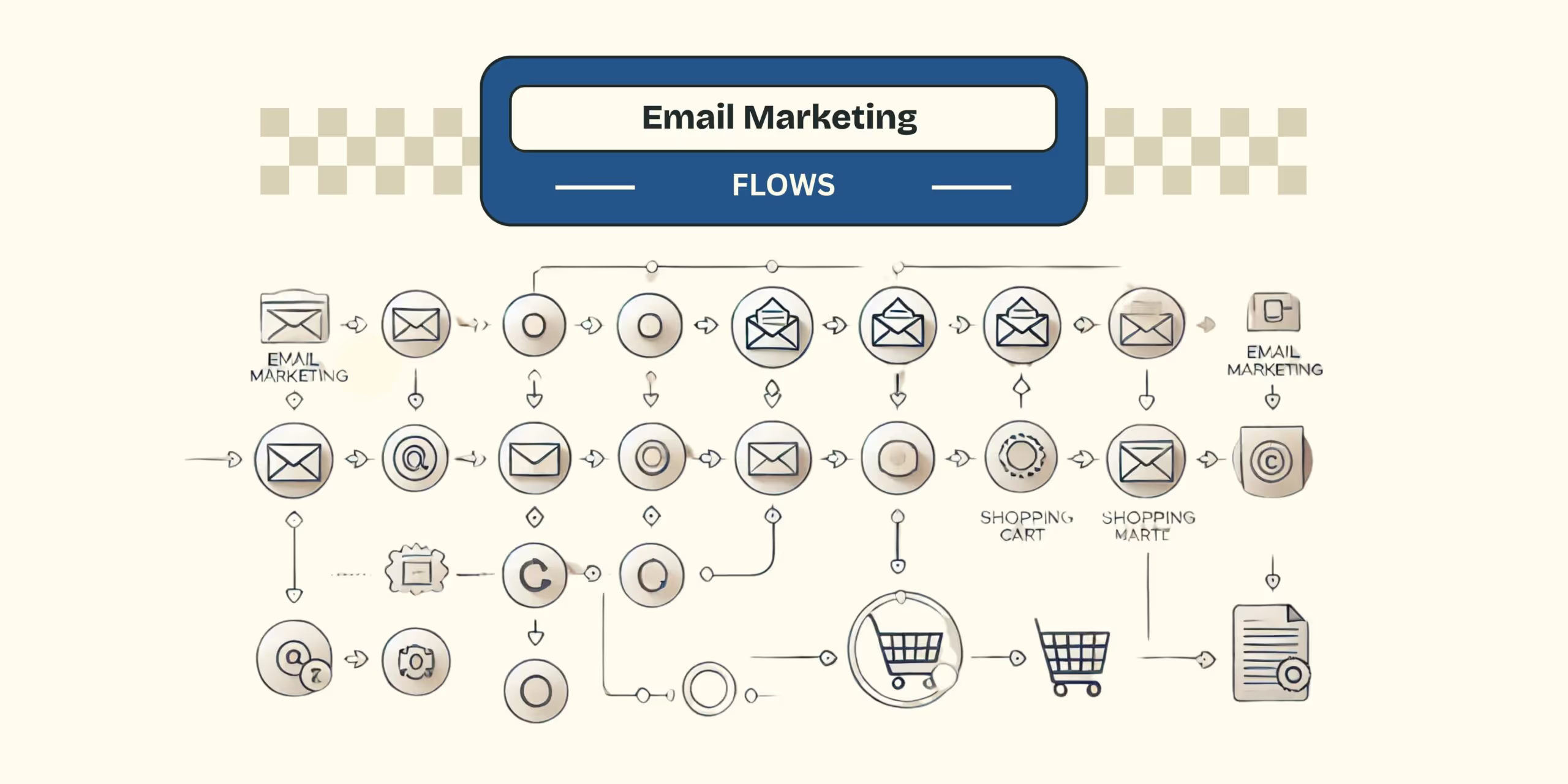
Core Email Marketing Flows: 2025 Essentials for Shopify

Top 5 Revenue-Generating Email Marketing Journeys (Straight from a Klaviyo Partner Agency)
The Long and the Short of It: Getting to “Yes” with Email Marketing
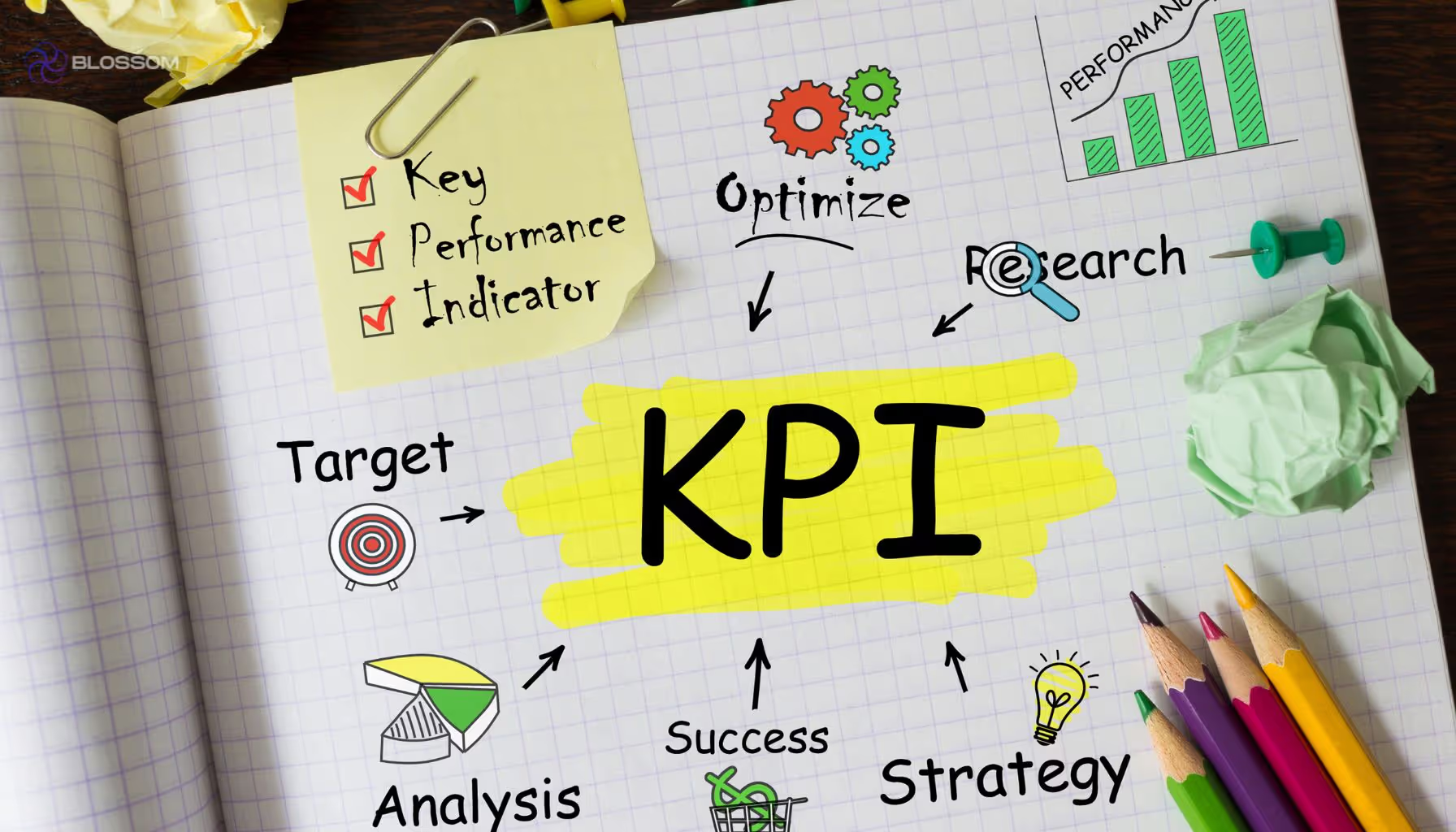
10 Email Marketing KPIs Every Marketer Needs to Know
3 Steps to Spring Clean Your Email Marketing Platform


Not Sure Where to Start?
Let's find the biggest retention opportunities in your business. Get a free Klaviyo audit or retention consultation.