Klaviyo email design allows you to create visually stunning campaigns that boost engagement and improve conversion rates.
🔍 Understanding the Terms
✅Klaviyo
A leading email and SMS marketing platform built for eCommerce businesses (especially Shopify, WooCommerce, and BigCommerce).
✅CTA (Call-to-Action)
A button or link that directs a user to take an action (e.g., “Buy Now,” “Shop the Drop”).
✅Hero Section
The top portion of an email, usually containing a visual, headline, and CTA—your first visual impression.
✅Responsive Design
An approach to email layout that adapts seamlessly between desktop and mobile screens.
✅Modular Email Template
An email template built from interchangeable content blocks (e.g., hero, product grid, testimonial) for speed and consistency.
✅Dark Mode
A display setting where light backgrounds switch to dark for eye comfort—affects email rendering.
✅Web Safe Fonts
Fonts supported across all devices and browsers (e.g., Arial, Helvetica, Georgia).
Why Klaviyo Emails Are Your #1 Conversion Asset
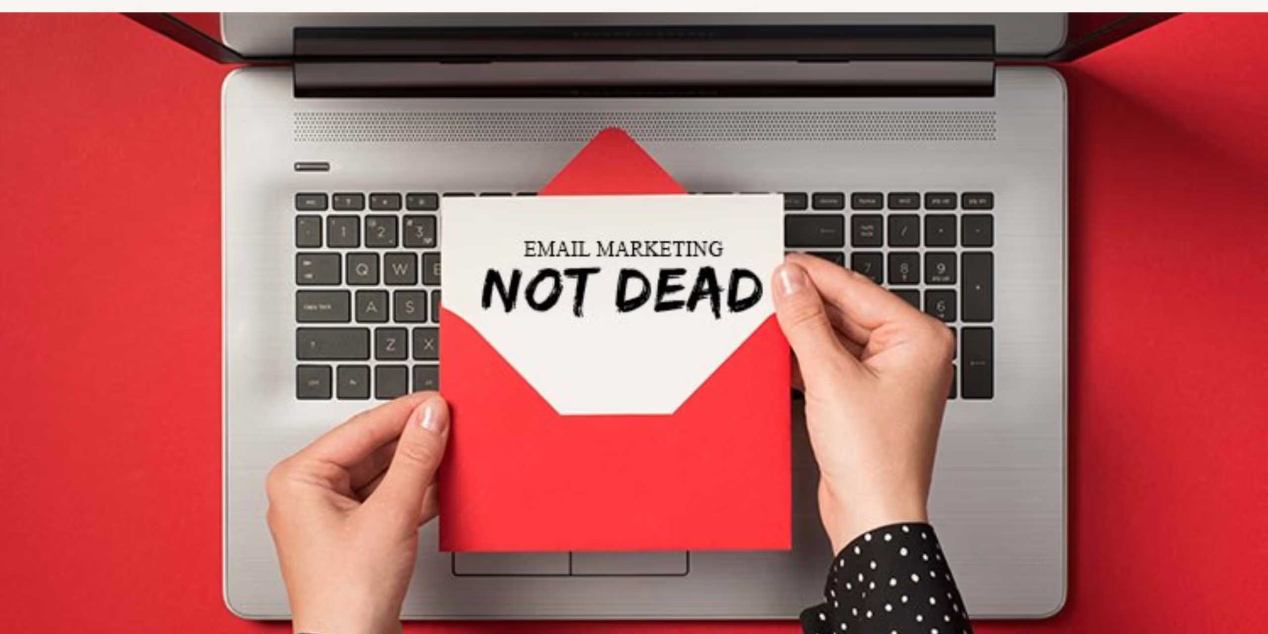
Email isn’t dead—it’s your highest ROI channel.
Klaviyo data shows email drives 30%+ of total DTC revenue for brands that use it effectively.
Average ROI for email: $36–$45 per $1 spent (DMA, 2024).
But the templates you use? That’s the engine behind it all.
A good Klaviyo email template is built for:
- Skimmability
- Mobile responsiveness
- Clear conversion flow
- Brand consistency
Let’s walk through everything you need to master Klaviyo email design.
1. Nail the Subject Line (Or Lose the Open)
Subject lines are make or break. Think of them like the headline of a sales page.
Subject Line Tips:
- ✅ Keep it under 9 words / 50 characters
- ✅ Prioritize clarity over cleverness
- ✅ Use emojis only if they add value
- ✅ Test with A/B subject line variations in Klaviyo
| Type | Example |
|---|---|
| Curiosity | “This is what your skincare is missing…” |
| Urgency | “Ends in 3 hours: Last chance to save” |
| Personalization | “James, your favorites are back” |
| Value | “Get 20% off + free shipping today only” |
Pro Tip: Always pair your subject with a compelling preheader to increase open rates.
2. Keep the Layout Simple (Don’t Make Readers Think)
Simplicity sells.
Use a single-column layout, max 600px wide. It’s easier to read, easier to code, and works better on mobile.
Structure Suggestions:
| Section | Purpose |
|---|---|
| Hero | Hook + CTA |
| Value Proposition | Highlight key benefit |
| Product Showcase | Show + tell |
| Social Proof | Reviews, testimonials, UGC |
| Footer | Links, contact, unsubscribe |
Avoid:
- Cluttered multi-column layouts
- Overusing dividers
- Small fonts or “wall of text” paragraphs
3. Wow Them With the Hero Section
This is where you stop the scroll.
Hero Best Practices:
- Logo at the top
- Bold headline (26–36px)
- Eye-catching image (JPEG/PNG/WebP)
- Clear CTA button
| Hero Element | Example |
|---|---|
| Headline | “Glow Starts Here.” |
| CTA | “Shop the Starter Kit” |
| Visual | Lifestyle image or product mockup |
Use mobile-friendly visuals (under 1MB) and test with/without text overlays.
4. Make the Message Flow (Visual Hierarchy Matters)
Reading should feel like a guided journey, not a maze.
Use:
- Large, bold headlines
- Section dividers (spacing = readability)
- Icons, emojis, or numbers to guide content
- CTA buttons in clear, isolated space
Tip: Use a Z-pattern layout (headline > image > body > CTA) to mimic natural eye movement.
5. Prioritize Readability (Good Design Is Invisible)
Most readers skim. Make your content effortless to absorb.
| Element | Best Practice |
|---|---|
| Font size | 18px for body, 24–36px for headings |
| Line spacing | 1.5–2x font size |
| Alignment | Left-align longer content blocks |
| Contrast | Black text on white or off-white background |
| Max line length | 50–75 characters per line |
Use bullet points to simplify features, offers, and product benefits.
6. Choose Fonts That Won’t Break
There’s a tradeoff between creativity and deliverability.
Web Safe Fonts:
- Arial
- Helvetica
- Georgia
- Verdana
Web Fonts (with fallbacks):
- Open Sans
- Lato
- Roboto
- Montserrat
Tip: Always set a fallback. For example:
cssCopyEditfont-family: 'Lato', Helvetica, sans-serif;
7. Design CTAs That Convert (Not Just Look Good)
The CTA is not a decoration—it’s your conversion lever.
| Element | Best Practice |
|---|---|
| Button text | Use action verbs (e.g., “Grab Yours,” “See It in Action”) |
| Size | 44px minimum height |
| Color | Contrast with background (e.g., black on white, yellow on navy) |
| Spacing | 30–50px padding around |
| Secondary CTA | Use lighter color or text-only style |
Use only one primary CTA per email. Too many = confusion = bounce.
8. Design Mobile-First (Your Customers Already Are)
Over 70% of email opens happen on mobile.
If your email isn’t built for mobile, you’re losing revenue.
Mobile Optimization Tips:
- ✅ Use a responsive template (Klaviyo supports this)
- ✅ Stack elements vertically
- ✅ Touch-friendly buttons (not tiny text links)
- ✅ Avoid full-width images with embedded text (they may scale poorly)
Test on:
- Gmail app (Android + iOS)
- Apple Mail
- Outlook mobile
9. Optimize for Dark Mode
Dark mode is default on many devices—and it can break poorly designed emails.
Dark Mode Tips:
- Transparent PNGs over white backgrounds = disaster
- Use logos with transparent backgrounds + white outlines
- Use true text, not image-based headlines
- Use high-contrast color schemes
Preview in:
- Apple Mail (Mac/iOS)
- Gmail (web + mobile)
- Outlook
10. Make It Accessible (Because It Should Be)
Accessibility increases your audience and builds brand trust.
| Tactic | Why It Matters |
|---|---|
| Alt Text | Allows screen readers to describe images |
| Minimum contrast | Makes text legible for colorblind users |
| Text-based content | Avoid image-only emails |
| Clear language | Improves comprehension for all reading levels |
Tool to Test:
- WebAIM Contrast Checker
- Figma’s accessibility plug-ins
11. Stay Compliant and Professional
Compliance isn’t optional—it’s legally required.
- Include an unsubscribe link (Klaviyo does this by default)
- Add your physical business address in the footer
- Don’t use deceptive subject lines
- Follow GDPR, CAN-SPAM, and TCPA laws
Consistency Is King: Use Modular Templates
Design once. Reuse forever.
What Is a Modular Template?
A set of pre-styled blocks:
- Hero
- Product grid
- CTA
- Testimonial
- Footer
These allow your team to build emails quickly without losing brand consistency.
Benefits:
- Saves time on every campaign
- Keeps branding tight
- Makes testing easier
- Enables fast seasonal changes
Example:
Blossom Ecom helped a leading wellness brand rework all templates using modular design. The result?
- 297% lift in click rate
- 61% open rate on abandoned browse flow
- 51% of 10-month revenue achieved in 3 weeks with new cart flow
Frequently Asked Questions (FAQ)
1. What’s the ideal length for a marketing email?
Keep it between 50–125 words. Long enough to explain, short enough to skim.
2. How many CTAs should I include?
One main CTA is ideal. You can add a secondary CTA, but keep the visual hierarchy clear.
3. What’s the best font size for email copy?
Aim for 18px body text and 24–36px for headers. Smaller than 14px? Too hard to read.
4. How do I test emails in Klaviyo before sending?
Use Klaviyo’s built-in preview tool + inbox testing platforms like Litmus or Email on Acid.
5. Should I include images of text?
Avoid it. Use actual HTML text whenever possible for accessibility and dark mode compatibility.
6. Do Klaviyo templates work with Shopify?
Yes. Klaviyo integrates seamlessly with Shopify and pulls dynamic content via product feeds and customer data.
Final Word: Build Emails That People Remember (and Click)
Good email design isn’t about flashy colors or clever tricks.
It’s about clarity. Relevance. And intention.
Klaviyo gives you the tools—but your template is the vehicle.
✅ Keep it simple
✅ Make it skimmable
✅ Design for mobile
✅ Personalize everything
✅ Test relentlessly
Want High-Converting Klaviyo Templates Built for You?
At Blossom Ecom, we design modular Klaviyo email templates that convert, scale, and stand out in crowded inboxes.
Whether you’re starting from scratch or reworking outdated flows, we’ll help you design templates that turn opens into orders.
→ Book Your Free Klaviyo Template Audit Now
Need help implementing this?
Let us take the hassle of managing your email marketing channel off your hands. Book a strategy call with our team today and see how we can scale your revenue, customer retention, and lifetime value with tailored strategies. Click here to get started.
Curious about how your Klaviyo is performing?
We’ll audit your account for free. Discover hidden opportunities to boost your revenue, and find out what you’re doing right and what could be done better. Click here to claim your free Klaviyo audit.
Want to see how we’ve helped brands just like yours scale?
Check out our case studies and see the impact for yourself. Click here to explore.

Read Our Other Blogs

Post-Purchase Email Flow: The Architecture That Drives Repeat Buyers


Sunset Flow: When and How to Remove Unengaged Subscribers


Cart Abandonment Flow: How to Recover Revenue Without Discounting


Not Sure Where to Start?
Let's find the biggest retention opportunities in your business. Get a free Klaviyo audit or retention consultation.


