Glossary of Key Terms
| Term | Definition |
|---|---|
| Email Deliverability | The ability of an email to reach the inbox rather than being marked as spam. |
| Image-to-Text Ratio | The balance between visual and written content in an email—key for inbox placement. |
| Brand Voice | The tone, language, and style your brand consistently uses to communicate. |
| CTA (Call-to-Action) | A prompt in the email encouraging the reader to take a specific action (e.g. “Shop Now”). |
| Responsive Design | An approach where the email layout adapts to different screen sizes and devices. |
| Alt Text | Descriptive text attached to images that helps with accessibility and image fallback display. |
| Modular Email Design | Building emails using flexible blocks or components for consistency and scalability. |
| White Space | The empty space between design elements that improves readability and user experience. |
Why This Matters: Design Without Strategy Fails. Branding Without Structure Flops.
In eCommerce email marketing, success isn’t just about a pretty layout or perfect brand palette. It’s about marrying your visual identity with strategic, conversion-friendly design.

Why? Because:
- A beautifully branded email that doesn’t load properly on mobile = lost conversion
- A perfectly optimized layout with zero emotion = forgettable
- A hard-selling layout that clashes with your DTC aesthetic = brand erosion
The most profitable brands don’t pick between branding and best practices.
They build emails that are beautiful, consistent, AND functional.
Let’s show you how.
Part 1: Why Brand Identity Still Matters in Email
Your brand is more than logos and colors—it’s how you show up and communicate consistently.
If your email looks and feels disconnected from your website, ads, and packaging, it creates friction in the customer journey.
A. Visual Brand Consistency
Your emails should mirror your site—so that when a subscriber clicks through, the transition feels seamless.
Use:
- Brand colors and button styles
- Consistent font pairings
- Logo placement in headers/footers
- Photography styles that align with your PDPs
Suggested Table: Brand Visual Elements to Standardize
| Element | Purpose | Tip |
|---|---|---|
| Colors | Reinforce brand recognition | Stick to 2-3 primary tones |
| Fonts | Maintain hierarchy and personality | Use web-safe or custom fonts via image fallback |
| Logo Placement | Build trust and familiarity | Use top-left or center, scaled for mobile |
| Image Style | Communicate mood and product usage | Stick to product-focused, lifestyle, or flatlay—don’t mix all three |
B. Brand Voice in Copy
If your social content is punchy and playful, but your email sounds like a corporate press release… you’ve lost the plot.
Keep tone consistent across:
- Subject lines
- Preheaders
- Body copy
- CTAs
Example:
| Platform | Brand Voice Example |
|---|---|
| “You’re gonna love this drop 😍” | |
| Email Subject Line | “🔥 New drop just landed — don’t miss it” |
| CTA Button | “Let’s go →” |
Part 2: Why Design Best Practices Still Rule
While branding draws your readers in, design structure drives the action.
A. Email Deliverability Depends on Balance
Emails that are too image-heavy get flagged as spam or load slowly—hurting engagement and conversions.
Best Practice:
- Maintain a 60:40 text-to-image ratio
- Include alt text on all images
- Don’t bury CTAs inside graphics
- Avoid embedding key info (discounts, dates) into images
Tools:
- Litmus – test deliverability across inboxes
- GlockApps – deliverability reports
B. Mobile Responsiveness Is Non-Negotiable
Over 47% of email opens happen on mobile. If your email doesn’t scale or respond properly, your campaign’s dead on arrival.
Optimize:
- Button size: Minimum 44x44px
- Font size: 16px+ body, 22px+ headers
- Use single-column layouts
- Stack elements vertically, not side by side
Table: Desktop vs. Mobile UX Checklist
| Element | Desktop Best Practice | Mobile Best Practice |
|---|---|---|
| Layout | Multi-column okay | Stick to 1-column |
| Image Sizes | 650–700px wide | Responsive scaling |
| Button Size | ~40px high | 44–50px min |
| Font Size | 16px+ | 16–18px+ for readability |
| Line Spacing | 1.5 | 1.6–1.8 for smaller screens |
C. Clear CTAs That Actually Convert
A CTA is the bridge between your content and revenue. Don’t make readers guess.
Tips:
- Use one primary CTA
- Make buttons bold, high-contrast, and action-oriented
- Use first-person verbs: “Get My Offer,” “Claim Now,” “See My Picks”
Bonus: Reinforce CTA multiple times — top, middle, and bottom — without sounding spammy.
D. Clean Layout = Higher Engagement
Clutter is the enemy. Your subscribers are scanning—not reading novels.
Keep it minimal:
- Use white space to guide the eye
- Break up text with visuals, dividers, or bullets
- Use modular layouts for quick load and flexible design
Table: High-Performing Email Layout Types
| Layout Type | Best For | Format |
|---|---|---|
| Hero + Text + CTA | Product drops, flash sales | Visual → Copy → Button |
| Grid Format | Collection launches | 2–4 product blocks |
| Storytelling (modular) | Education or community emails | Header → Image → Benefit → CTA |
| Text-Only Email | Personal, plain-text, VIP messages | Paragraphs + inline links |
Part 3: How to Blend Brand + Best Practices
This is where the magic happens. You don’t have to pick sides.
Here’s how to blend bold branding with smart design structure:
Strategy Framework
| Layer | What to Apply |
|---|---|
| Branding | Use tone, colors, logos, lifestyle imagery |
| Best Practices | Stick to clean layout, mobile scaling, balanced text/image |
| Performance Layer | Use data from ESP to iterate on subject lines, CTAs, content blocks |
Test, Learn, Refine
The balance isn’t static. Different campaigns, products, and audiences respond to different formats.
A/B Test:
- Branded vs. Minimalist design
- Bold voice vs. straight-to-the-point
- One CTA vs. multiple contextual links
Use analytics to answer:
- What drives clicks AND conversions?
- Where do people drop off in the layout?
- Do branded elements distract or add value?
Frequently Asked Questions (FAQ)
1. Should I prioritize branding or deliverability in email design?
Both matter. Start with brand identity, but always optimize for inbox placement and responsiveness to protect your metrics.
2. What’s a good image-to-text ratio in email design?
Roughly 60% text, 40% images. This maintains deliverability while preserving design appeal.
3. How can I make branded emails mobile-friendly?
Use responsive layouts, larger fonts, single columns, and ensure images scale down without cropping.
4. Can plain-text emails still reflect my brand?
Yes—use consistent tone, message structure, and signature blocks. Plain-text emails are great for VIPs, transactional comms, and personal outreach.
5. How many CTAs should I include in an email?
One primary CTA with optional supporting contextual links. Too many CTAs cause confusion and lower click rates.
6. What email design mistakes should I avoid?
- Relying only on images
- Using small fonts
- Not testing mobile
- Ignoring alt text
- Burying CTAs at the bottom
Final Takeaway: Function + Feeling = Profit
You don’t need to choose between creativity and conversion.
You need to:
- Make your email feel like your brand
- Make it look clean and perform well
- Make sure every asset is engineered to sell or build trust
That’s what the best brands do. That’s what your subscribers deserve.
Need Help Finding Your Brand-Design Sweet Spot?
At Blossom Ecom, we design high-converting email strategies that don’t sacrifice soul for structure.
Whether you’re scaling a DTC powerhouse or building a brand from scratch, we’ll help you turn inboxes into income.
Get a free design audit today and start sending emails that do it all: convert, engage, and look damn good doing it.
Need help implementing this?
Let us take the hassle of managing your email marketing channel off your hands. Book a strategy call with our team today and see how we can scale your revenue, customer retention, and lifetime value with tailored strategies. Click here to get started.
Curious about how your Klaviyo is performing?
We’ll audit your account for free. Discover hidden opportunities to boost your revenue, and find out what you’re doing right and what could be done better. Click here to claim your free Klaviyo audit.
Want to see how we’ve helped brands just like yours scale?
Check out our case studies and see the impact for yourself. Click here to explore.

Read Our Other Blogs

Sunset Flow: How to Win Back Unengaged Subscribers Before You Suppress Them


Welcome Flow Optimization: How to Turn New Subscribers Into First-Time Buyers Faster

Popup Strategy for Ecommerce: How to Grow Your List Without Training Customers to Wait for Discounts

Klaviyo Segments vs Lists: How to Structure Your Audience Architecture for Scalable Retention

Email Deliverability for Ecommerce: The Complete Guide to Landing in the Inbox

Klaviyo List Hygiene: How to Clean Your Email List Without Killing Your Revenue
Sunset Flow: How to Win Back Unengaged Subscribers Before You Suppress Them
Welcome Flow Optimization: How to Turn New Subscribers Into First-Time Buyers Faster
Popup Strategy for Ecommerce: How to Grow Your List Without Training Customers to Wait for Discounts

Email Offer Architecture: How to Structure Promotions That Protect Margin and Still Convert

Klaviyo vs Attentive: Which Platform Is Right for Your DTC Stack in 2026

Migrating to Klaviyo: The Step-by-Step Playbook for Switching ESPs Without Losing Revenue

Browse Abandonment Flow: The Underbuilt Sequence Quietly Leaking Revenue

Post-Purchase SMS Flow: How to Use Text Messages to Build Loyalty After the First Order

Retention Marketing Dashboard: The Exact Metrics and Reports You Should Be Reviewing Weekly

Agency vs In-House Email Marketing: What Actually Moves the Needle for DTC Brands

SMS Marketing Strategy for Ecommerce: The Complete Guide

How to Set Up Klaviyo Flows: Complete Setup Guide

A/B Testing for Email: What to Test, How to Measure, When to Ship

Email Marketing KPIs: The Only Metrics That Matter for DTC

Email Revenue Attribution: What Klaviyo Gets Right and Wrong

Popup Strategy for Ecommerce: 6 Types That Actually Convert

RFM Analysis for Ecommerce: Segment Your Customers by Value

Email Segmentation for Ecommerce: The 5-Layer Model for DTC Brands

Welcome Offer Optimization: Converting Subscribers Without Deep Discounts

Email Warmup Strategy: How to Build Sender Reputation From Scratch

Email List Hygiene: How to Clean Your List Without Killing Revenue

SPF, DKIM, and DMARC: Email Authentication Explained for DTC Brands

The Complete Retention Marketing Strategy Guide (2026)

Winback Flow: How to Re-Engage Lapsed Customers Before You Lose Them

How to Audit Your Email Flows (The 125-Point Checklist)

Post-Purchase Email Flow: The Architecture That Drives Repeat Buyers

Sunset Flow: When and How to Remove Unengaged Subscribers

Cart Abandonment Flow: How to Recover Revenue Without Discounting

How to Build a Welcome Flow That Actually Converts

How to Build an Email Campaign Calendar Without Discounting

Browse Abandonment Flow: Converting Window Shoppers Into Buyers

The Abandoned Cart Email Strategy That Actually Recovers Revenue

How to Build a Welcome Flow That Actually Converts

Personalizing Push Notifications for Better Retention Outcomes
How to Craft Email Newsletters That Build Real Brand Loyalty

Top 3 Best eCommerce Content Management Systems of 2025
Email Marketing vs. Social Media: Which One Should Your Brand Focus On?

Attract More Customers: Which Videos to Use in Your Email Marketing and Why
8 eCommerce Customer Service Mistakes You NEED to Stop Making (Like, Yesterday)
Creating The Perfect E-Commerce Tech Stack

Types of Content eCommerce Brands Need in Their Marketing Mix
Ecommerce Email Mistakes: Blossom Ecom Article on How to Stop Sending Bad Emails & Start Making More Money
Boost Your Bottom Line: The Ultimate Guide to Integrating Website and Email Strategies for Your eCommerce Business
6 Powerful Ecommerce Loyalty Program Examples (and How to Build Your Own)
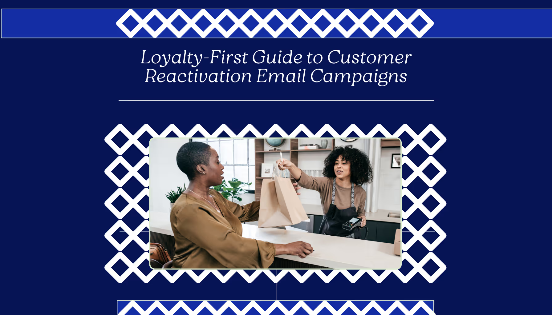
Loyalty-First Guide to Customer Reactivation Email Campaigns
Using Email Marketing to Supercharge Your Loyalty Program
Unpacking Brand and Conversion in E-Commerce Design
13 Scary E-Commerce Mistakes (and How to Avoid Them)

How to Reduce Your E-Commerce Bounce Rate and Boost Engagement
Combining Content and Commerce for E-Commerce Success
Email Marketing Tips + Trends

E-Commerce Returns Analysis & Crafting a Profitable Returns Policy

9 Pro Tips for A/B Testing Emails with HubSpot
AI and Email Marketing: The Future is Here
How to Skyrocket Your Email Open Rates and Click-Through Rates
Email Isn’t Dead: 4 Reasons It’s Still a Digital Marketing Powerhouse

Email Marketing Series – #3: Building a Strong Email List
Email Marketing Series – #4: 9 Tips for Creating High-Impact Email CTAs

Email Marketing Series – #2: How to Craft Attention-Grabbing Subject Lines
Email Marketing vs. Social Media Marketing — Which Should I Use?
Email Marketing Series – #1: Crafting an Effective Email Marketing Strategy
Email Open Rate: A Practical Guide
3 Effective Strategies to Make Email Your Marketing Heavyweight Champion

How to Attract New Leads with Video in Your Email Marketing
How to Determine the Profitability of Your eCommerce Website
Multi-Channel eCommerce: The Key to Growing Your Online Business
Understanding eCommerce Conversion Rate & Optimization
How to Optimize Your eCommerce Website for More Conversions
Top 3 eCommerce and Digital Marketing Trends for 2025

Optimizing Your Email Marketing Strategy: A/B Testing Explained
35 Eye-Opening Email Marketing Stats You Need to Know
7 Email Marketing Tips to Boost Your SEO

11 Common Email Marketing Mistakes That Are Tanking Your Conversions (And How to Fix Them)
Strategic SEO Tips for Email Marketing: Boost Engagement and ROI
How to Measure and Increase Email Marketing ROI (Plus Templates That Convert!)

Do Lifecycle Email Campaigns Really Drive Conversions? Here’s What We Found
How to Use Remailing in Your Email Marketing Strategy

B2B Email Marketing: Building Relationships and Converting Leads
Core Email Marketing Flows: 2025 Essentials for Shopify

Top 5 Revenue-Generating Email Marketing Journeys (Straight from a Klaviyo Partner Agency)
The Long and the Short of It: Getting to “Yes” with Email Marketing
10 Email Marketing KPIs Every Marketer Needs to Know
3 Steps to Spring Clean Your Email Marketing Platform

How to Use Artificial Intelligence (AI) in Email Marketing in 2024

How To Create Marketing Emails That Engage Your Audience and Get Results

Why SMS is the Perfect Addition to Any Marketing Mix

Why Personalization is Critical for eCommerce Growth

How to Grow Your Startup’s Email List: Lessons from Daycation

How We Achieved a 27% Winback Rate with a Smart Email Strategy for Dumpling

The Hidden Pitfalls of Email Marketing: Blacklists and Spam Traps
The iOS18 Mail Update: What Marketers Need to Know

Supercharging Customer Journey Automations with Email Touchpoints
Why Your Abandoned Cart Series Needs More Than One Email
13 Simple Design Hacks Using Klaviyo Email Marketing & Shopify
5 Simple Tactics to Grow Your Klaviyo SMS List Without Overcomplicating Things

Why Klaviyo SMS Crushes Other SMS Providers (And How Ignoring It Costs You Revenue)

10 Klaviyo Strategies That Drove Over $50 Million for Our Clients


Not Sure Where to Start?
Let's find the biggest retention opportunities in your business. Get a free Klaviyo audit or retention consultation.